CLEARWAY COMMUNITY ENERGY
MISSION
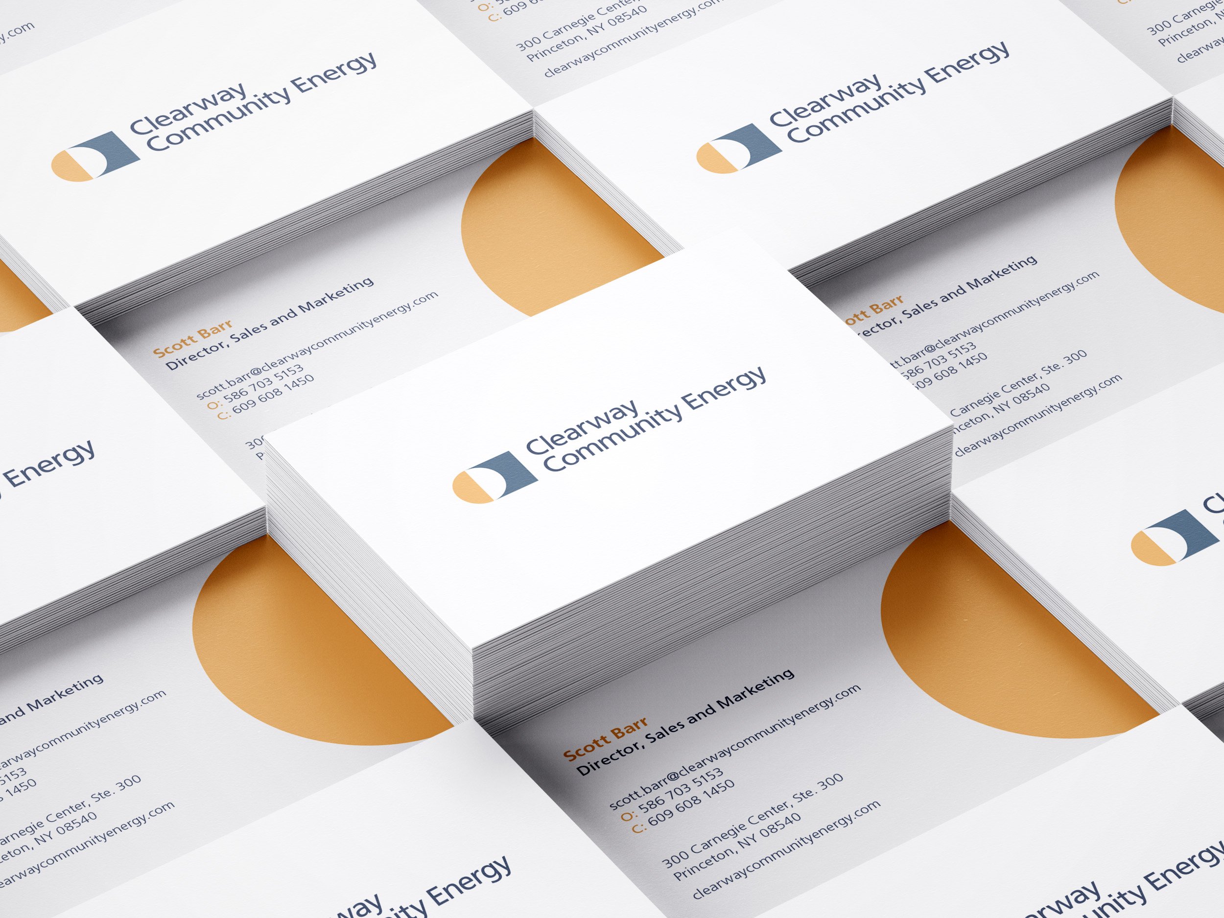
Clearway Community Energy is a comprehensive energy solutions provider. They are a subsidiary of a larger parent, Clearway Group—a leader in the renewable energy sector. They needed a brand strategy and identity to formally position them in the Clearway family, as well as in the industry. I was one of two designers who created their new identity and visual language.
IDEA
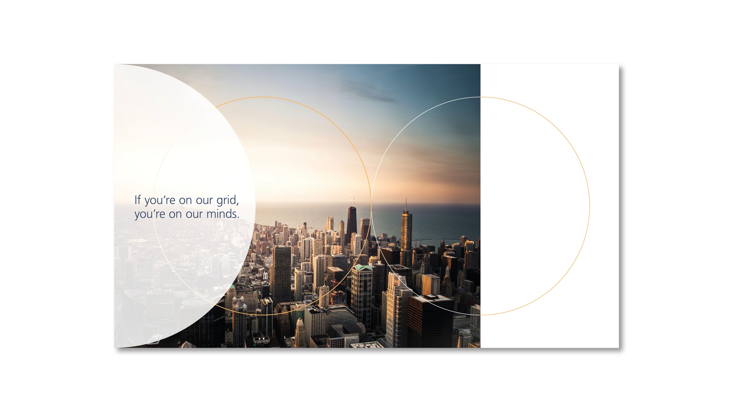
With the strategy team at BasedOn, we first developed the company’s name. We then established their brand idea, “Staying Power.” The visual language boasts the core shapes of the parent icon, the circle and square, as elements of recognition and symbols of powerful, consistent energy service for the day and night and the hot and cold.
The brandmark carries this concept into its colors and conforms to the typography of the family.
INTEL
• Studio Client Work
• Studio: BasedOn
• Naming
• Brand Identity Design